7 Critical Things to Know When Building Any Mobile App

This blog post builds on concepts proposed in an earlier post about not all mobile apps being created equally. If you are a developer who is in the process of migrating to mobile this post is for you. It’s intended to raise awareness of important items to consider in your requirements. My goal is to help you identify some of the major gotchas early on in the development process and improve your chances for success.

There are many more details to learn on the topics I’ve described below. The good news is that in the last few years the amount of deeply helpful documentation has expanded considerably. Where possible I’ve tried to include links related to each topic.

Touch-based Workflows. Recent research has shown that people use their smartphones more often than web apps, and they spend roughly 80% of their time on social media and games. Because of this and the fact that smartphones today are touch driven and not mouse driven, you have to take that into account in your user interface design. Touch implies many things including gestures and multi-touch. You can toss your old conceptions of user interface design based on desktops and tablets, and check out Android’s recommendations as well as Apple’s. My strong recommendation is to hire a UX designer to help you through building a user interface.

Mutliple form factors come with various screen sizes and densities. Long gone are the days of building for just three main browser types. Now you have to take into consideration iPhones, iPads, tablets, numerous different style androids as well as desktop and laptops. Android defines the following screen sizes and, as you can see, this is quite varied and smaller than a typical laptop or desktop. Those typically run 1024 x 768 or greater.

  • xlarge screens are at least 960dp x 720dp
  • large screens are at least 640dp x 480dp
  • normal screens are at least 470dp x 320dp
  • small screens are at least 426dp x 320dp

This is important to know because an app that looks good on an iPad may not look good, or display correctly, on the four inch display of a Motorola Atrix at 960 x 540. A button that looks correctly sized on one smartphone may look too big on another. A whopping 84% of all Android screens are what Android defines as normal size (>=  470dp x 320dp) and between either medium dpi (~160dpi) or high dpi (~240dpi). But, you still have to take into consideration other densities. I also recommend taking a look at new HTML5 browser-based technologies to help with addressing this problem, such as CSS media queries.

Inconsistent Internet. It’s a best practice to check if internet connections exist and gracefully handle HTTP requests when the internet is down, as I blogged about here.  Depending on your application and needs, you should also monitor whether or not a wireless connection can be made and then allow the application to switch to wireless where possible. Wireless also has the advantage of using less battery power.

Slower Connections. And, on a related note, you can’t always depend on 4G connections having consistent maximum download speeds. Over the course of a user session, the connection speed will vary widely and you should plan for that. I’ve been trying to find some stats on mobile internet quality world-wide, if they are out there they are hard to find. But, we’ve all experience spotty mobile internet coverage. Take this into account if you are transferring large amounts of data between your servers and your app. You should also consider detecting when the user is in an area of greater bandwidth and use that to download more data less often. Use loosely coupled and event driven architectures. Test app load times on various devices and around town and away from your office.

Less CPU Horsepower. While the latest generation of four core phones are certainly the most powerful phones yet. In general, applications and web pages will run slower on phones than they do on your development machine running a desktop browser. Take older generation phones into account because they are usually significantly slower than the newer phones. There are a few workarounds in HTML5 to help with this, in that done correctly they can offload rendering to the hardware. In native applications be aware of memory leaks because, remember, more memory usage means less battery life and applications that can run slower over time.

Support across multiple operating system versions. Remember on Android that the vast majority of users are still running v2.2 – v2.3.7 even though v4.x is currently shipping. You’ll have to do some research on your target market and find out what versions and type of phones they are using. You can’t support everything, but you can make educated guesses. Apple, on the other hand, has a significantly more limited selection of phones and tablets that you have to support, and they do a great job helping you support those.

There are some solutions that help with building cross-platform mobile apps, to go into more detail will take another blog post. Here’s a few: Adobe Flex, PhoneGap and Titanium. Keep in mind that the future of Flex, as a development platform, is being called into question after Adobe open sourced everything but the browser and desktop runtimes to the Apache Foundation. PhoneGap and Titanium offer what is now being called “hybrid” solutions where you can build an application in JavaScript, for example, and then compile that code for native deployments on Android and iOS.

Battery Life. Ah, battery life is last but certainly not least. Be aware of how battery intensive your application is and try to minimize battery consumption as much as possible. The Android online docs have a number of highly information articles on this subject. Smaller app footprint in memory means less battery consumption. Heavy CPU usage means more battery usage. Minimize GPS usage through smart algorithms to help preserve battery life.  Switch to 802.11 wireless connections where possible, since this requires less battery power than 3G and significantly less power than 4G.

So, there you go. I hope these suggestions help. If you have more suggestions based on your own experience please post a comment!

References:

Android Gestures

Android Optimize Battery Life

Android Screen Sizes and Densities
CSS media queries

Android UI Design

Android Model for Best GPS Performance

iOS User Experience

HTML5 Hardware Acceleration

Event-based Architectures for Adobe Flex

Tips for Clearing the Browser Cache: IE, Chrome and Firefox

When doing web development, especially JavaScript/HTML, it’s sometimes hard to tell if your changes loaded when you refreshed the web page, in fact sometimes your changes aren’t reflected. The best thing to do is delete the cache and then reload the page. So, this post will tell you how to that for the three most used browsers – Firefox, IE and Chrome.

Before I tell you how to do it, it’s good to know what the cache does and why. It’s basically a file directory where your browser stores temporary files such as web pages (e.g html files), images (e.g. png’s) and other web-related items including sound files ( e.g. mp3’s). The idea behind storing these files is the user’s experience: it’s faster to retrieve a local file than it is to retrieve it from some remote web site and the page appears to load faster to the user. Another reason is reduces server load for high usage sites because many of the files are loaded locally for repeat visitors. But, even though you may care about this your end users certainly don’t.

Chrome 16.x (Windows)

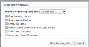
Go to the top right of the browser and click on the wrench symbol, then Tools > Clear Browsing data. Chrome will then load the Options page and let you choose by timeframe how far back to go when deleting data. When you are doing frequent web development the “past hour” option is awesome. That way you can delete your most recent work and all your other cookies and data will stay in the cache.


Firefox 10.x (Windows)

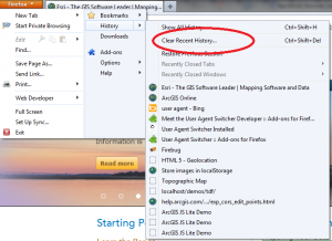
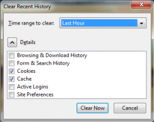
Go to the top left of the browser and click the pull down menu, then History > Clear Recent History. Firefox then loads a popup window that also lets you choose how far back in time to delete data. Firefox was the first browser to offer the “last hour” option. Again, it’s a really nice thing to have when you are doing frequent builds and constantly reloading the browser.


Internet Explorer 9 (Windows, of course)

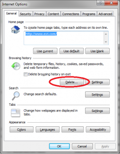
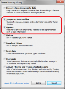
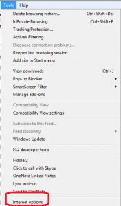
For IE, go to Tools > Internet Options > Delete. Unlike Firefox and Chrome, IE deletes everything and I don’t know of a way to tailor the tool to not do that. This is something to be aware of it IE is your primary browser and you need to blow away the cache. All password cookies and anything else you have stored will be deleted. IE does, however, have a nice feature that I use a lot which is the Delete Browser History on Exit option. Again, if you are doing lots of builds (code then reload page to see changes) then consider checking this option and save yourself a bunch of time clicking through menus every time you reload a page.


10 Essentials for developing commercial Flex 4.5.1 mobile applications

This post is for Adobe Flex/Actionscript/Flash developers who are looking to build commercial-grade mobile apps. I’ve tried to pull together a high-level check list of items you’ll need to build successful and stable apps based on Flex 4.5.1. I’ve also uploaded a fully-functional prototype that demonstrates these concepts in a real-time, GPS navigation app. You can download the app here. So, here goes.

1. Set your initial splashScreenImage and application icon. For your app to look professional you’ll want to display an image while it launches so there isn’t just a blank screen. Here’s a great blog post that goes into more detail and covers handling multiple screen resolutions. One caveat on the splashScreenMinimumDisplayTime property is use this with caution. If you delay the app start too much you run the risk of really annoying users.

<s:TabbedViewNavigatorApplication xmlns:fx="https://ns.adobe.com/mxml/2009"
xmlns:s="library://ns.adobe.com/flex/spark"
splashScreenImage="@Embed('assets/splashscreen.png')"
splashScreenMinimumDisplayTime="1500"
splashScreenScaleMode="letterbox">

And, be sure to set the application icon. When you install your app, this is the image that will be displayed in the phone’s UI. Configure this in the yourappname-app.xml file. Note if you image icon isn’t the absolute correct size you’ll get a compiler error:

<icon>
     <image16x16>assets/appicon16x16.png</image16x16>
     <image32x32>assets/appicon32x32.png</image32x32>
     <image36x36>assets/appicon36x36.png</image36x36>
     <image48x48>assets/appicon48x48.png</image48x48>
     <image72x72>assets/appicon72x72.png</image72x72>
     <image114x114>assets/appicon114x114.png</image114x114>
     <image128x128>assets/appicon128x128.png</image128x128>
</icon>

2. Manage your applications life-cycle. The best article to read is the old but still very useful Hero View and ViewNavigator  – Functional and Design Specification and this blog post on Understanding View and ViewNavigator. For some reason the ViewNavigatorEvent poperties listed below aren’t documented in the Adobe on-line help. I’ve complained and so should you!

  • viewActivate Event – called when the view is fully activated. It actually happens after the creationComplete event. If you want to know more about view states in general then read this Adobe article.
  • viewDeactivate Event – use this in a View if you want to handle certain things when the user changes to a different View and the current one has been deactivated.
  • removing Event – This is called right before the viewDeactivate Event. So if there is something you want to do right before the view is fully deactivated then use this event.
  • persistNavigatorState – This property works at the application level and allows you to save the navigator’s view stacks and navigation history to a local persistent object. This is a property that is set in the main application’s mxml file and by default it is set to false. The standard architecture of a mobile app is to destroy the view contents when a user switches views so that the application saves memory. But, if there is a significant cost to destroying and recreating a particular view then you should test setting this property to never. Cost in this case means the amount of time, memory and CPU it takes to destroy and recreate a view. Also, if your end user is repeating this over and over that will ultimately affect battery life. Once a view is destroyed my guess is that memory is set for garbage collection. For info see this very informative Adobe blog post.
    <s:TabbedViewNavigatorApplication xmlns:fx="https://ns.adobe.com/mxml/2009"
         xmlns:s="library://ns.adobe.com/flex/spark"
         persistNavigatorState="true">
    
  • destructionPolicy – This is a property that can be set on individual views and can prevent an individual view from having all its data destroyed when the view is deactivated. For example, you may allow some views to be destroyed where others are mission critical and shouldn’t be destroyed because it’s too expensive to recreate them. As I write this, I believe this only works if the persistNavigatorState property has been set but it’s been a while since I verified that.
    <s:View xmlns:fx="https://ns.adobe.com/mxml/2009"
    		xmlns:s="library://ns.adobe.com/flex/spark"
    		destructionPolicy="never"
    		viewActivate="settingsViewActivateHandler(event)"
    		viewDeactivate="settingsViewDeactivateHandler(event)">
    

3. Manually changing views. Use pushView(), popView(), popToFirstview(), popAll() and replaceView().

  • pushView() navigates the user to a new screen.
  • Use popView() to move back to the previous screen.
  • popToFirstView() changes to the screen to the very first view that was opened. This is programmatically referred to as the view at the bottom of the view stack and uses the FIFO principal.
  • popAll() returns a blank screen. I’ve never used this and I haven’t come across a use case (yet) that would require given the user a blank screen.
  • replaceView() removes the current view and replaces it in the view stack with the new view you that you assign.

4. Passing data between views. One of the requirements of commercial apps is sharing data between different views. There are a number of ways to do this including singletons, dependency injection and using the data property in the pushView() method. Here are some good articles on all three:

  • Using singletons or tightly coupling data. This is typical for prototyping where you don’t want or need the overhead of a full framework. The prototype app download (link at top of page) uses a singleton model for simplicity.
  • Using framework-based, dependency injection. Use this when you want to use a framework such as Swiz, Parsely or Robotlegs.
  • Using the pushView() data property. When you have fairly simple data needs use this via the pattern pushView(viewClass:Class, data:Object = null, context:Object = null, transition:spark.transitions:ViewTransitionBase = null) Note that this pattern is for basic usage and the data object only supports standard content within the object such as Strings, Array, ArrayCollection, etc. If you have a custom class be sure to register them with the registerClassAlias() method or you’ll get runtime errors when you go to switch views.

5. Set application permissions.These are root permissions that are set via manifestAdditions for Android and infoAdditions for iOS – and these are located in the yourappname-app.xml file in your application’s root directory. Here’s an Adobe article with additional details. When the application is installed the user will be alerted to what permissions you are asking for.

<android>
     <manifestAdditions><![CDATA[
          <manifest android:installLocation="auto">
	       <!--See the Adobe AIR documentation for more information about setting Google Android permissions-->
	       <uses-permission android:name="android.permission.INTERNET"/>
	       <uses-permission android:name="android.permission.WRITE_EXTERNAL_STORAGE"/>
	       <uses-permission android:name="android.permission.ACCESS_FINE_LOCATION"/>
	       <uses-permission android:name="android.permission.DISABLE_KEYGUARD"/>
               <uses-permission android:name="android.permission.WAKE_LOCK"/>
               <uses-permission android:name="android.permission.ACCESS_NETWORK_STATE"/>
               <uses-permission android:name="android.permission.ACCESS_WIFI_STATE"/>
	   </manifest>
	]]>
     </manifestAdditions>
</android>

6. Shutdown the app. This only works on Android. On iOS, the user has to do this manually.

NativeApplication.nativeApplication.exit(); 

7. Temporarily disable the screen saver. This is required in apps where you don’t want the screen to go to sleep such as navigation apps where it may be open for a long time without any user intervention. You also need to set the WAKE_LOCK permission in the manifest file.

<uses-permission android:name="android.permission.WAKE_LOCK"/>


//Make sure we are on a mobile device and then
//keep the application awake so it doesn't go to sleep and close the screen.                                                      
if(Capabilities.cpuArchitecture == "ARM")
{                                                                             
     NativeApplication.nativeApplication.systemIdleMode = SystemIdleMode.KEEP_AWAKE;                                                                            
}

8. Detecting when phone rotates. If you need to know when the phone rotates use this listener:

stage.addEventListener(StageOrientationEvent.ORIENTATION_CHANGE,stateChangeHandler);

9. Gracefully fail when network connection is lost. If your app needs network access then it’s a best practice to gracefully fail and let the user know when internet connection is lost and then again when it’s restored.

public function NetworkChangeController(autoStart:Boolean = false)
{             
    var req:URLRequest = new URLRequest(_MAP_URL);
    _urlMonitor = new URLMonitor(req);
    _urlMonitor.addEventListener(StatusEvent.STATUS,serviceMonitorStatusHandler);

    NativeApplication.nativeApplication.addEventListener(Event.NETWORK_CHANGE,networkChangeHandler);
}

private function networkChangeHandler(event:Event):void
{
     if(!_urlMonitor.running)
     {
          _urlMonitor.start();
     }
}

private function serviceMonitorStatusHandler(event:StatusEvent):void
{
     trace("Network Status Event: " + event.code + ", " + _urlMonitor.available);
     _urlMonitor.stop();
     event.code == "Service.unavailable" ? _doSomething = false : _doSomething = true;
}

10. Multiple Device Support –sizing for different dpi’s. Last, but not least is using CSS and media queries to help with sizing and layout. Media queries are actually part of the W3C core CSS spec. The cool thing about them is they let you auto-majically detect the users screen dpi (dots-per-inch) and operating system and adjust your CSS accordingly. This saves a huge amount of work on your part:

@namespace s "library://ns.adobe.com/flex/spark";
/* DPI specific styles */
s|Button{
     color:#000000;
     fontWeight:bold;
}

@media (application-dpi:240)
{
     s|Button{
          color:#FF0000;
     }
}

@media (application-dpi:320)
{
     s|Button{
          color:#0000FF;
     }
}

/* Platform specific styles */
@media (os-platform:"IOS")
{
     s|Application{
          backgroundColor:#FFCCCC;
     }
     
     s|ActionBar{
          defaultButtonAppearance:beveled;
     }                      
}

@media (os-platform:"Android")
{
     s|Application{
          backgroundColor:#CCCCFF;
     }
}