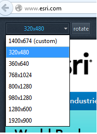
There’s been a lot of buzz about Firefox’s Responsive Design View and to a lesser extent Chrome’s User Agent swapper. These built-in, ready-to-go tools are awesome and huge time savers for web developers. But, they are NOT a substitute for testing your app across multiple browsers and on different devices.
A highly simplified definition of responsive design is it lets your web app dynamically adjust content based on screen height, width and pixel density. There are over a dozen responsive frameworks including Twitter Bootstrap, 960 Grid, jQuery and Titan. The number of them has exploded in recent years and it’s a daunting task to figure out which ones meet your project’s needs. So, the intent of this blog post is to provide some super simple, quick guidelines for getting started with testing your apps against them.

What does Firefox’s Responsive Design View do? It lets you change the dimensions of your application on-the-fly and even rotate it by simply clicking a button. Very cool! It lets you pretend to see what your app will look like on different screen sizes. In the latest versions of Firefox, you can access this view via Tools > Web Developer > Responsive Design View. See the screenshot for an example of what the tool looks like.
What does Responsive Design View not do? It does not emulate the actual functionality of browsers on different sized devices. So, simply swapping screen sizes on your Windows desktop Firefox browser is not a valid substitute for physically testing your app on a tablet or smartphone. Firefox offers a separate download for Firefox on Android if you want to test on a mobile device.
What does a user-agent do? The user-agent is intended to identify a browser to a webserver or web application. It is sent by the browser in the HTTP request header. The agent can be parsed and used to determine if any specific actions need to be taken within an application. So, if you are using Chrome you can spoof using Internet Explorer 9. Here’s an example of a user-agent for Firefox running on Windows 7 64-bit:
Mozilla/5.0 (Windows NT 6.1; WOW64; rv:16.0) Gecko/20100101 Firefox/16.0
The most common use of user-agents on webservers is for creating site visit statistics that provide a generalized break-down of site visitors by browser type.
The most common use of user-agents in web applications is for determine how content is displayed and how JavaScript may be used in that browser. If you have some JavaScript that you know won’t work in IE, then you want to try and do your best to detect specific versions of IE to control your content.
Why spoof the user-agent? Simply put, it tricks an application into being displayed based on the user-agent characteristics. The key word is “display”. The user-agent spoof does not emulate actual browser functionality. It only shows you what the app looks like if it contains browser-specific code by tricking it into thinking it’s running on a specific browser. However, to properly test full browser functionality you need an actual install of the browser on a specific device and operating system.
Is user-agent detection reliable? In general, no. User-agent detection within your code is not reliable. Because user-agents can be easily spoofed these days, it is no longer a single reliable source for determining how your application will display content. Even jQuery, for example, recommends against relying on user-agents as a sole means of determining browser type.
For JavaScript, it’s usually best to check to see what is supported by a particular JavaScript library, for example in jQuery.
$("p").html("This frame uses the W3C box model: <span>" +
jQuery.support.boxModel + "</span>");
Or, if you are building larger applications consider a special detection library like Modernizr that helps with HTML, CSS and JavaScript coding patterns.
What about CSS3 Media Queries? CSS3 Media Queries are considered to be an integral part of responsive design coding patterns. They let you use CSS to detect certain characteristics of a browser in order to adjust the styling of an application by doing things such as swapping visibility of HTML elements or even adding or removing DIVs from the layout. Using Firefox’s Responsive Design tool or Chrome’s user-agent swapper can be used to test these elements with a healthy dose of caution. You still need to do your final testing for browser-specific functionality on the respective browsers themselves. Here is an example of a media query looking for maximum and minimum screen width:
@media screen and (min-device-width:768px) and (max-device-width:1024px) {
    /* styles go here */
}
You can also run media queries from within JavaScript:
var portraitMatch = window.matchMedia("(orientation: portrait)");
portaitMatch.addListener(orientationChangeHandler);
function orientationChangeHandler() {
  if (portraitMatch.matches) {
    // Portrait orientation
  } else {
    // Landscape orientation
  }
}
Using Media Queries is considered a best practice when used in conjunction with a feature detection library such as Modernizr, or feature detection coding patterns to validate if a CSS feature works on a particular browser. Feature detection code may be the way to go if you are only detecting a handful of CSS3 attributes and don’t need the extra weight of a full blown library like Modernizr, for example:
if (document.createElement("detect").style.borderRadius === "") {
    //TODO if borderRadius detected
}

if (document.createElement("detect").style.WebkitBorderRadius === "") {
    //TODO if webkitBorderRadius detected
}